您现在的位置是:网站首页> 编程资料编程资料
使用CSS实现盒子水平垂直居中的方法(8种)CSS 水平居中并限定最大的宽度实现CSS实现子元素div水平垂直居中的示例CSS中的translate(-50%,-50%)实现水平垂直居中效果css3 flex实现div内容水平垂直居中的几种方法CSS3 不定高宽垂直水平居中的几种方式CSS3实现水平居中、垂直居中、水平垂直居中的实例代码手把手教你CSS水平、垂直居中的10种方式(小结)web前端之css水平居中代码解析
 2021-09-03
905人已围观
2021-09-03
905人已围观
简介 这篇文章主要介绍了使用CSS实现盒子水平垂直居中的方法(8种),文中通过示例代码介绍的非常详细,对大家的学习或者工作具有一定的参考学习价值,需要的朋友们下面随着小编来一起学习学习吧
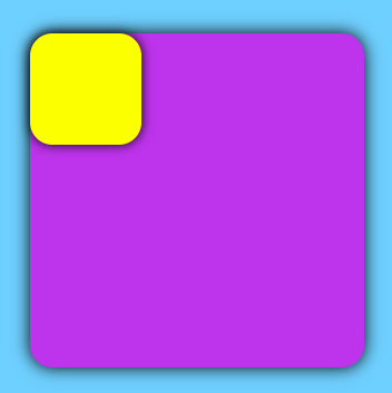
原始代码:
center.html:
Center
center.css:
body { background-color: #6ed0ff; } .father { background-color: #be33ec; border-radius: 20px; box-shadow: 0 0 15px rgb(0, 0, 0); margin: 100px auto; width: 300px; height: 300px; } .son { background-color: #fcff00; border-radius: 20px; box-shadow: 0 0 10px rgb(0, 0, 0); width: 100px; height: 100px; } 原始效果:
实现子盒子相对于父盒子垂直居中效果:
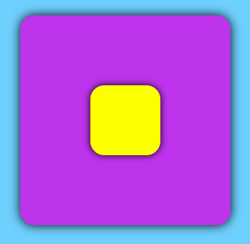
1. grid
.father { display: grid; } .son { align-self: center; justify-self: center; } 2. absolute + 负margin
.father { position: relative; } .son { position: absolute; left: 50%; top: 50%; margin-left: -50px; margin-top: -50px; } 3. absolute + transform
.father { position: relative; } .son { position: absolute; left: 50%; top: 50%; transform: translate(-50%, -50%); } 4. absolute + margin: auto
.father { position: relative; } .son { position: absolute; left: 0; right: 0; top: 0; bottom: 0; margin: auto; } 5. flex
.father { display: flex; justify-content: center; align-items: center; } 6. margin+transfrom
.father { overflow: hidden; } .son { margin: 50% auto; transform: translateY(-50%); } 7. table-cell
.father { display: table-cell; text-align: center; vertical-align: middle; } .son { display: inline-block; } 8. inline-block + vertical-align
.father { text-align: center; line-height: 300px; } .son { display: inline-block; vertical-align: middle; } 到此这篇关于使用CSS实现盒子水平垂直居中的方法(8种)的文章就介绍到这了,更多相关CSS 盒子水平垂直居中内容请搜索以前的文章或继续浏览下面的相关文章,希望大家以后多多支持!
相关内容
- 纯 CSS 实现蜡烛融化(水滴)的示例代码CSS+JS实现水滴涟漪动画按钮效果的示例代码纯css实现Material Design中的水滴动画按钮
- CSS3 实现发光边框特效一文教你玩转CSS border(边框)CSS 奇思妙想边框动画效果的实现CSS3 按钮边框动画的实现两款纯CSS3鼠标经过按钮边框动画特效一篇文章带你学习CSS3图片边框css3多种边框悬停按钮填色动画特效css 透明边框background-clip妙用CSS3实现缺角矩形,折角矩形以及缺角边框CSS边框长度控制功能的实现CSS实现半透明边框与多重边框的场景分析
- CSS实现表格首行首列固定和自适应窗口的实例代码css display table 自适应高度、宽度问题的解决详解CSS多种三列自适应布局实现CSS实现背景图片屏幕自适应的实现css3实现自适应浏览器图片布局特效css实现六种自适应两栏布局方式CSS将img图片填满父容器div并自适应容器大小css实现两栏布局,左侧固定宽,右侧自适应的多种方法
- CSS 说明横向进度条最后显示文字的实现代码css 横向进度条和竖向进度条实现代码
- CSS3制作3D立方体loading特效10种CSS3实现的loading动画,挑一个走吧?CSS3实现渐变的loading加载进度条特效代码CSS loading效果之 吃豆人的实现使用css实现android系统的loading加载动画CSS 实现各种 Loading 效果附带解析过程
- css之Display、Visibility、Opacity、rgba和z-index: -1的区别解决CSS中子元素z-index与父元素兄弟节点的层级问题css 层叠与z-index的示例代码CSS3关于z-index不生效问题的解决z-index为负值的元素无法点击到的解决方法CSS z-index 层级关系优先级的概念css z-index层重叠顺序使用介绍css中z-index: 0和z-index: auto的区别
- 纯css3实现横向无限滚动的示例代码CSS3制作圆形滚动进度条动画的示例css实现隐藏滚动条并可以滚动内容的实例代码CSS3实现3D小球滚动撞击遮挡板特效源码Css3实现无缝滚动防抖css文字阴影渐渐模糊效果的实现css3悬停按钮-CSS3鼠标悬停按钮阴影缩放特效代码使用纯 CSS 实现滚动阴影效果
- CSS3实现莲花绽放的动画效果CSS3制作圆形滚动进度条动画的示例一篇文章带你学习CSS3图片边框CSS3实现的3D导航栏旋转切换特效源码CSS3实现时间轴特效CSS3制作皮卡丘动画壁纸的示例详解background属性的8个属性值(面试题)纯css3制作的发光loading图标加载动画特效源码css3实现二维码扫描特效的示例CSS3实现彩色进度条动画的示例基于css3制作秋天落叶主题动画特效代码
- CSS3制作圆形滚动进度条动画的示例纯css3实现横向无限滚动的示例代码css实现隐藏滚动条并可以滚动内容的实例代码CSS3实现3D小球滚动撞击遮挡板特效源码Css3实现无缝滚动防抖css文字阴影渐渐模糊效果的实现css3悬停按钮-CSS3鼠标悬停按钮阴影缩放特效代码使用纯 CSS 实现滚动阴影效果
- CSS实现进度条和订单进度条的示例CSS3制作圆形滚动进度条动画的示例CSS3实现彩色进度条动画的示例CSS3实现渐变的loading加载进度条特效代码css 实现圆形渐变进度条效果的示例代码jQuery+CSS3实现的双层圆环形进度条加载动画特效利用css3实现进度条效果及动态添加百分比css 横向进度条和竖向进度条实现代码纯css3实现的百分比渐变进度条加载动画特效源码CSS3+SVG实现S形进度条加载动画效果源码使用CSS3实现环形进度条效果